Good Design, Bad UX
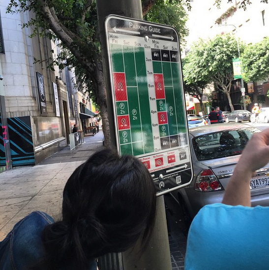
This parking sign project popped up in my newsfeed a few times last week. LA is piloting this new signage design.

The two problem with the sign? It’s not usable and it doesn’t address the root cause of the problem. It’s a perfect example of good design, bad user experience (UX).
Good Design
I find the visual design quite pleasing.
They used a format that we are all familiar with. The signs are laid out the way our calendar apps display our schedule. Leveraging familiarity is a good design choice.
They use big, bold colors to represent concepts. My eyes like the simplicity.
They trimmed down the sign to the basic questions we all want to know: can I park here and how long? Keep It Simple Stupid.
Bad User Experience
So while the sign is visually pleasant, it doesn’t work for me. By the way, I have driven daily in Brooklyn, Queens, and Manhattan when I lived in NYC.
1. This sign is not safe. (this is kindda important)
In NYC, different street have different hours when you can or can’t park. You can park here from midnight to 6 AM, there from midnight to 3 AM, and the street next to it? 8 AM to 12 PM. It looks like this sign is designed in a way that stretches the hour marks to accommodate for the individual streets. In the other words, the spacing between hour marks on this sign differ from street to street. This means you can’t just glance at a sign to know whether you can park or not. Because of the small font, you need to carefully drive up close and read the sign.
This is dangerous! You want to be able to glance at a sign and then shift your eyes back on the road, where it belongs. After all, this is NYC. You share the road with cars, pedestrians, and cyclists.
2. I’m not convinced this sign solves the problem.
One value proposition is the ability to combine multiple signs into one consolidated sign. I suspect, though, that the totem pole of parking signs is symptomatic of the way goverment works — different departments with disjointed processes. Actually, the most annoying signs are the ad-hoc signs. The ones where they post up a piece of paper or temporary signage for pop up farmers market, on location film and television, or concerts.
Solving the problem of unified signage may not be creating a unified sign, but changing the process of how various organizations get their signage approved in the first place.
UX is not always about making better product, sometimes it’s about better policies and processes.
My suggestion?
Integrate with Google Maps and other GPS
When I’m traveling to a new place, I usually have Google Maps or some sort of GPS system on. If my GPS tells me ahead of time of where I can park, that would be idea. I wouldn’t have to scour the streets for signage, then spend time reading the sign when I should be focused on the road.
Also, often by the time I read the signage I already missed a good chunk of available parking spots. Then I have to loop around the block and see whether there are any parking space alongside the street.
If Google Maps can help me plan out a “parking finder route,” that would be ideal. I wouldn’t have to even worry about reading signage or plotting routes for how to find parking.
“But what about times when you don’t use Google Maps?”
Valid question. The times when I don’t use Google Maps are times when I travel to places I’m already familiar with. In those cases, I’m usually fairly familiar with where I can park at what time, so I wouldn’t need this feature anyway. Moot!
By the way, this has been piloted
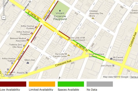
Dynamic LCD Displays
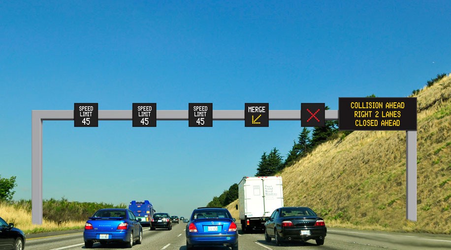
Dynamic LCD displays that display clearly “yes/no” for parking. In Seattle, some of the speed signs are on interactive displays. The speed limit then can change with the traffic congestion. This is a much more pricey implementation of course. There’s a lot more to manufacture, install, and maintain.
But, imagine if instead of parking signs, there are interactive displays that plainly tells you “2 hrs until 8 PM” or “No parking until 7 PM.” It ignores all the other rules that may not apply, like showing you what Saturday rules when it’s Thursday. Different signage requestors (concertos, schools, road cleaners) can input their rules and it all gets compiled into one unified message.
I’m sure my suggestions have their pitfalls as well. And I would love to hear what they are.
Design and UX is a process, a conversation between different parties. So, even though I think the user experience for this “Google Calendar Signage” is bad, the fact that the designer got me to write about it and think about it means they’ve won.