Guqin Part 4: Jian Zi Pu Font (减字谱)
JianZiPu is a way to write notation for Guqin (古琴) music. Guqin music is traditionally written using a character based system, but the character set isn't really found in any known languages. This font solves that problem.
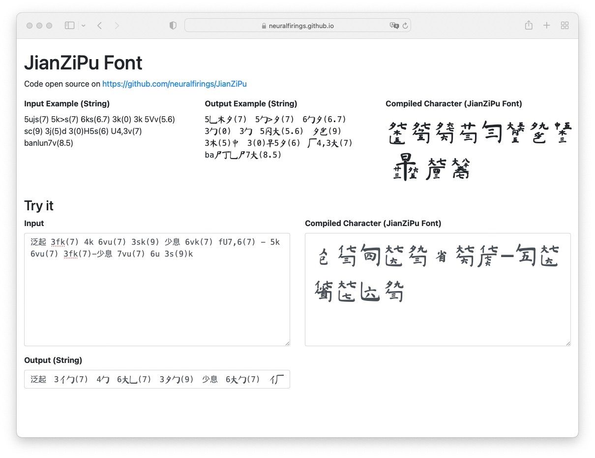
If you want to jump to trying this out, visit the JianZiPu Font Demo Page. The font can be downloaded as .otf format. I also included a few HTML header tags that you can use to use the font on website.
Background
JianZiPu (减字谱) is a way to write notation for Guqin (古琴) music. Each character comprises of different components. Each components tells some information about which string to pluck, which finger to pluck it with, where to hold down a string, whether to slide up or down, and so on.
.character.png)
This is an example of a "character" in JianZiPu.

The red box shows which finger to use on the left hand (the 4th, 名), the blue box shows where the left finger should press down (on the 9th hui , 九), the orange box shows which string to pluck (6th string, 六), and the thing around the orange box shows which finger on the right hand to pluck (middle finger plucking towards the player, 勾). For more information, you can read my post (and gripes) on JianZiPu.
The problem with designing a JianZiPu font...
The characters in this font is not really available in any easily accessible font package, and I'm sure with all the different components and possible combinations if you make one character for each permutation, you'd get way too many fonts for a font system to handle.
My solution...
I broke apart each character into various components. You can think about each component as a letter. Like the lettters "C", "A", "T" combines together to spell "CAT". In my font, the letters overlap one another in a way that the right components are in the right space in a square-ish area. When you encounter a space, the font proceeds to the next square-ish area.
Take the example above. In Chinese, the various components comprising this character is 六名勾(九). 名 and 勾 are simplified into the component in the red box and component outside of the orange box, respectively.
When my font encounters a "word" like 六名勾(九), it picks the variant of the 六 character that occupies the bottom third of the square, the variant of the 名 character that occupies the top left portion of the square, and so on. The steps described in this paragraph is done by a JavaScript compiler, which picks the right variant that the font renders.
I also made a roman alphabet based short hand. So instead of writing "六名勾(九)," you can also write "6sk(9)" which would provide the same result.
6-- 6th stringk-- gou (pluck inward with the right middle finger)s-- press the string with left hand 4th finger on...(9)-- hui position 9
This gives us...
The full capabilities (including how to write chords/撮, glissandos/滚沸, and other special characters), please see the documentation on my GitHub page.
Example
Here's an example of the font in use for one of my favorite pieces in the classical Guqin repetoire, 梧叶舞秋风 (Plane Leaves Dance in Autumn).
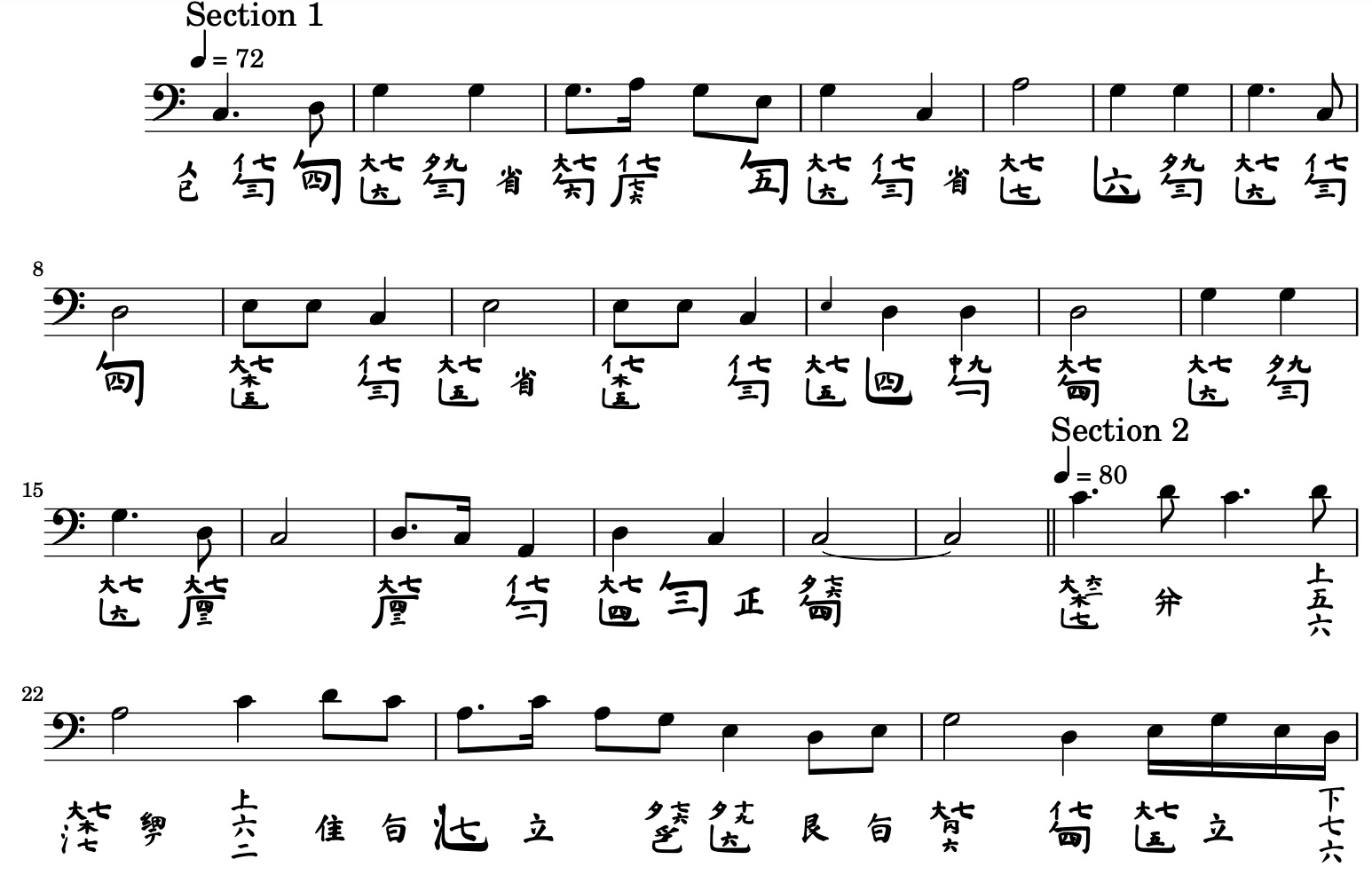
(note: the vertically stacked characters, like the last few characters 下七六, are rendered using the Ma Shan Zheng font)
For more examples, you can visit my personal Guqin Music Library. Not all the music here has JianZiPu, since I prefer using the NL Tab structure.
Technical stuff
Font was designed using Sketch/Figma for graphics, and FontForge for font creation. I used Javascript to pick the correct variants of the font components (or "letters").
Other parts in the Guqin series:
Intro | Part 1 | Part 2| Part 3 | Part 4 | Coda (TLDR & links)